INTRODUCING: VPC WATCHES

Fratello writer and former vintage watch dealer Thomas van Straaten introduces his uncompromising vision of the ultimate GADA (Go Anywhere Do Anything) watch. Design by Max Resnick. Typography by Samuel Baker.

Preparing for launch end of 2023.

Follow the progress on Instagram and on Fratello.

Subscribe to our newsletter below to be first to know when the VPC Type 37HW presale starts.

GADA ACCORDING TO VPC

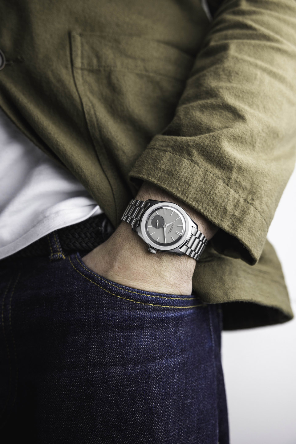
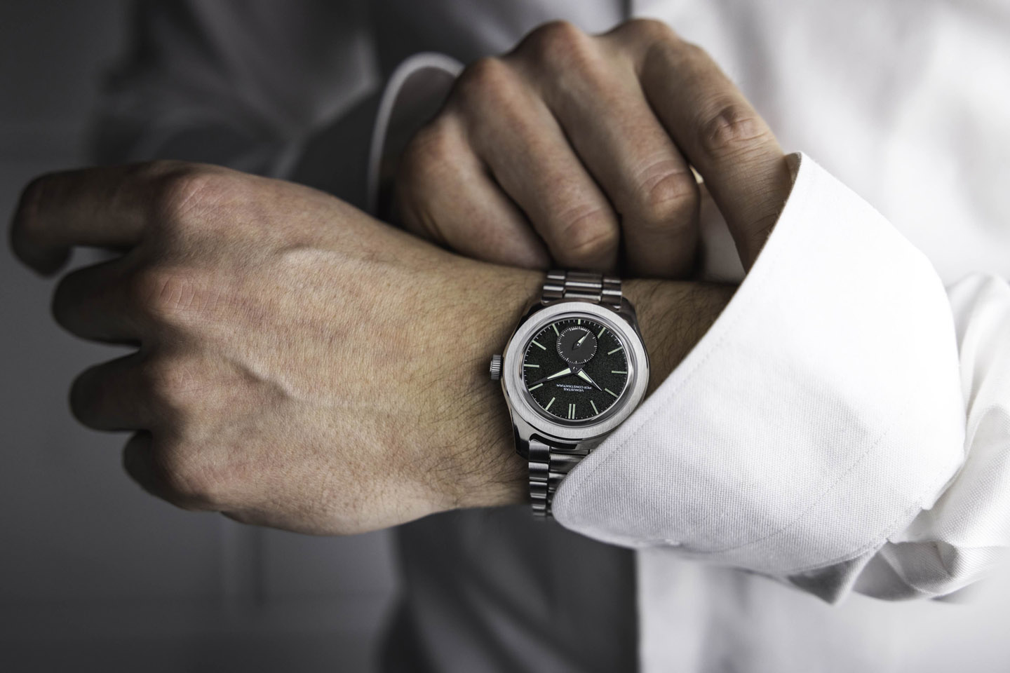
Our watches are meant to be companions for life. That means two things: 1. they should last. And 2. They should be ready for anything you may find yourself doing at any time, both technically, and stylistically.

A watch that is acceptable anywhere anytime can be bland and uninspired. A jack of all trades is a master of none. So we set the bar a little higher. A VPC watch should excel whenever, wherever.

This means we maintain a high technical standard in terms of ruggedness, water resistance, reliability, and legibility. We do this, however, in the subtlest, most elegant way we can. For instance: legibility is accomplished through an ultra-clean dial layout, rather than through greater dimensions. This philosophy poses a massive challenge in design, development, and manufacturing. But it is one we feel is unique and worth pursuing.

Our future releases may have a specific emphasis, say aquatic use or travel, but they should always be GADA (Go Anywhere Do Anything) at heart. 

So this is what you can expect from VPC. Truly capable watches, designed to excel wherever, whenever. 

IT IS ALL IN THE DETAILS

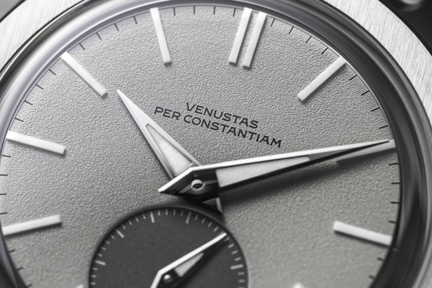
Venustas Per Constantiam translates roughly as beauty through restraint. That restraint is visible in every design choice we make. VPC watches aren’t loud or flashy. At first glance, you might even think they are…well…simple. 

But the devil is in the details. We have taken the sports mentality of “you may out-talent me, but you will not out-work me” and applied it to watch design. It is safe to say we have obsessed over details maniacally, beyond what anyone will ever consciously register. All in a bid to create something that is deceptively simple, but thoroughly beautiful and functional. 

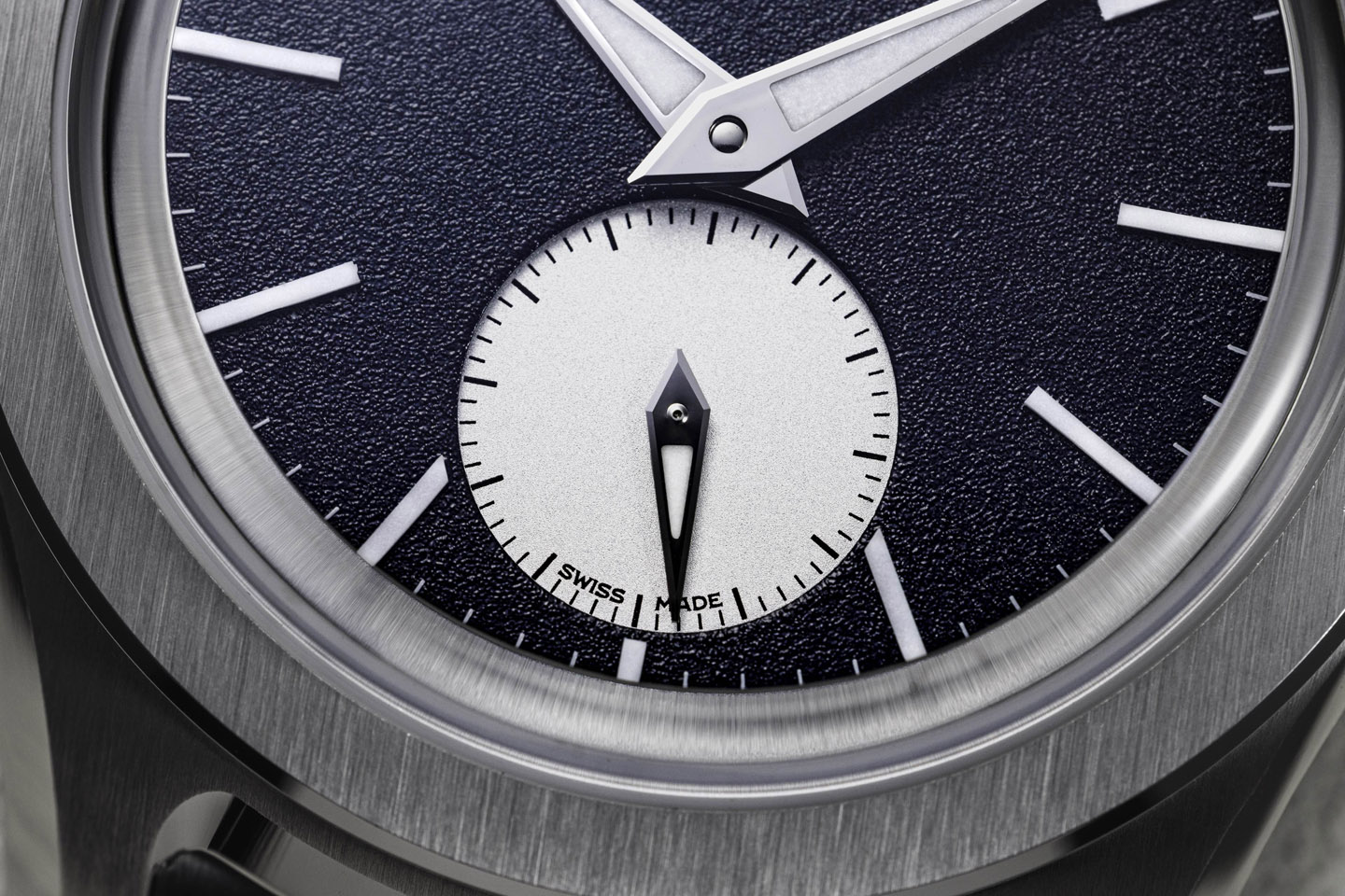
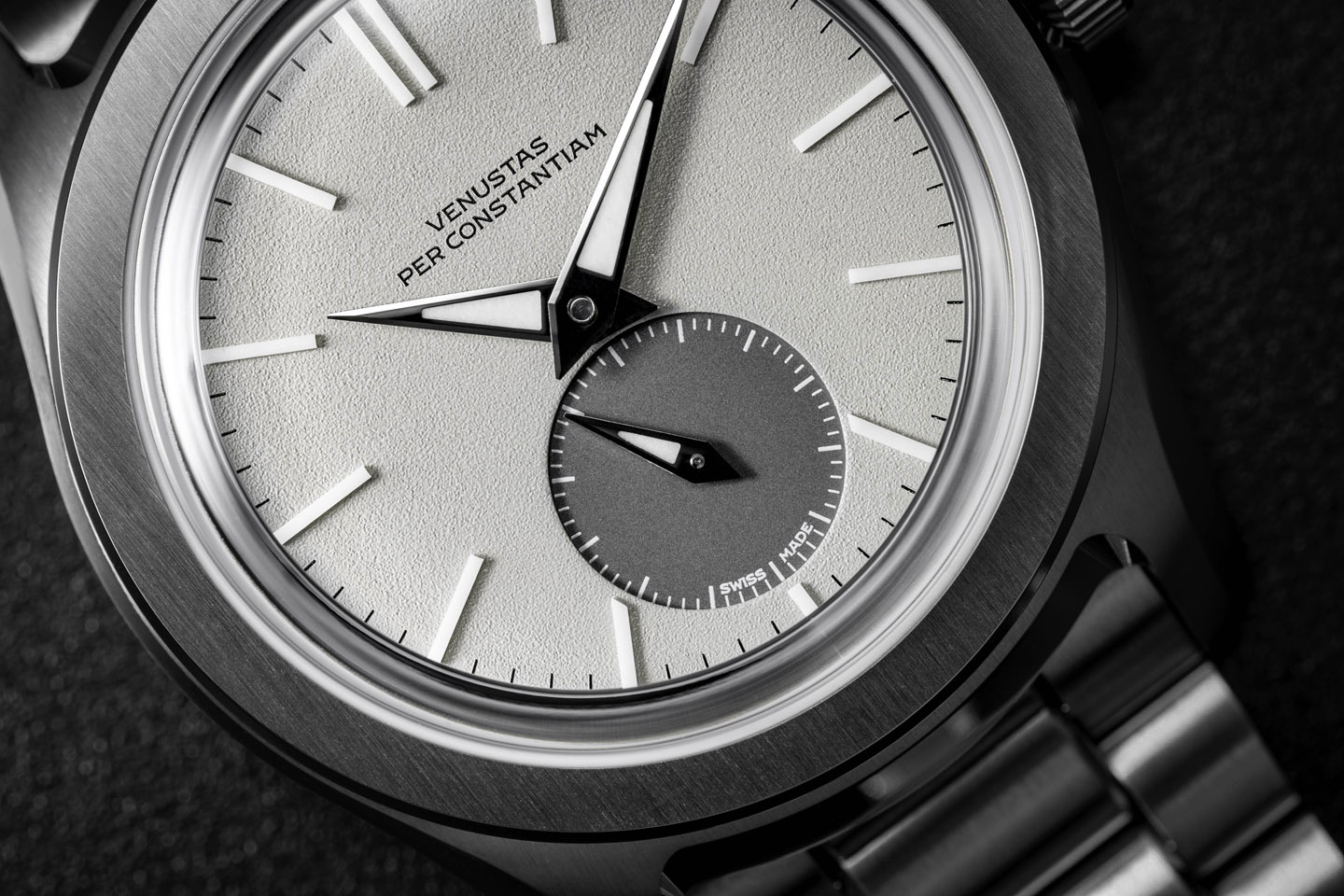
Our “Swiss Made” signature, for instance, has been in nine positions before we were finally happy with its placement. Our desire to improve the industry-standard bracelet endlink led to an absolutely unique case shape. We went through a library worth of books on color science just to pick three dial colors. And when we couldn’t find the right typeface for our dials, we developed our own typography from scratch.

TYPOGRAPHY

We don’t want to say things were better in the past. But some things were. Watch dial typography was better when draftsmen rendered it by hand, optimizing for small-scale legibility and printability through old-world techniques, as opposed to modern brands laser-printing in Arial. 

We went on a quest for a typeface in the style of vintage watch dials. We tried hundreds of fonts. Nothing came quite close enough. And so we collaborated with watch typography specialist Samuel Baker. He took the typical quirks of those typefaces and blended them with contemporary styling and function. The result is a fully tailor-made typeface named “Venustas”. 

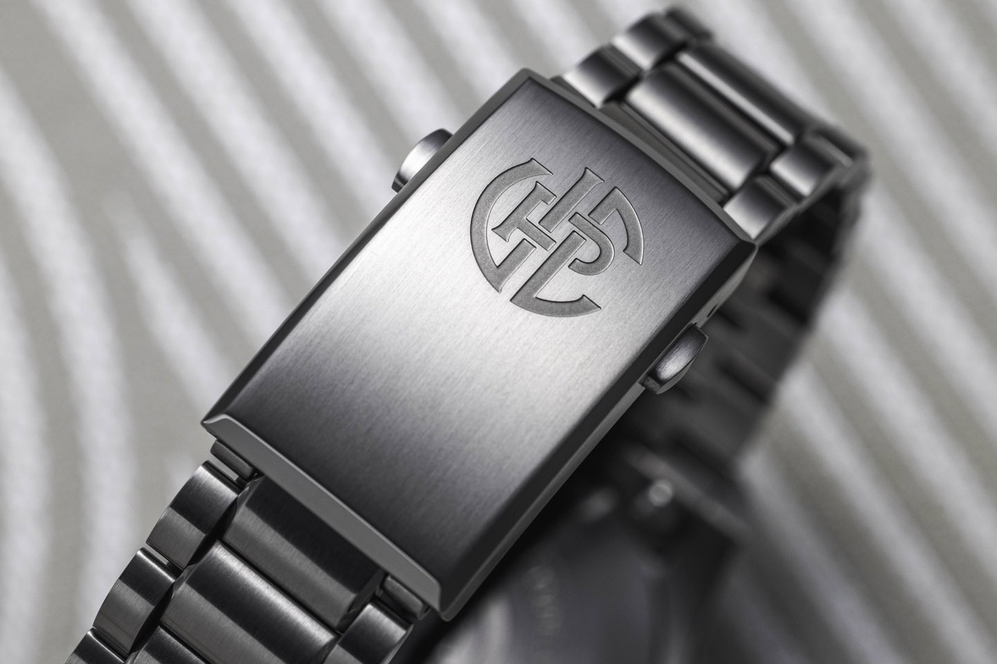
This typeface sits proudly on our dials. The wordmark and the “Swiss Made” signature are both set in Venustas. The case back inscription is also executed in the same style, around our VPC monogram.

> Learn more about our typography here

UNIQUE BRACELET/STRAP INTEGRATION

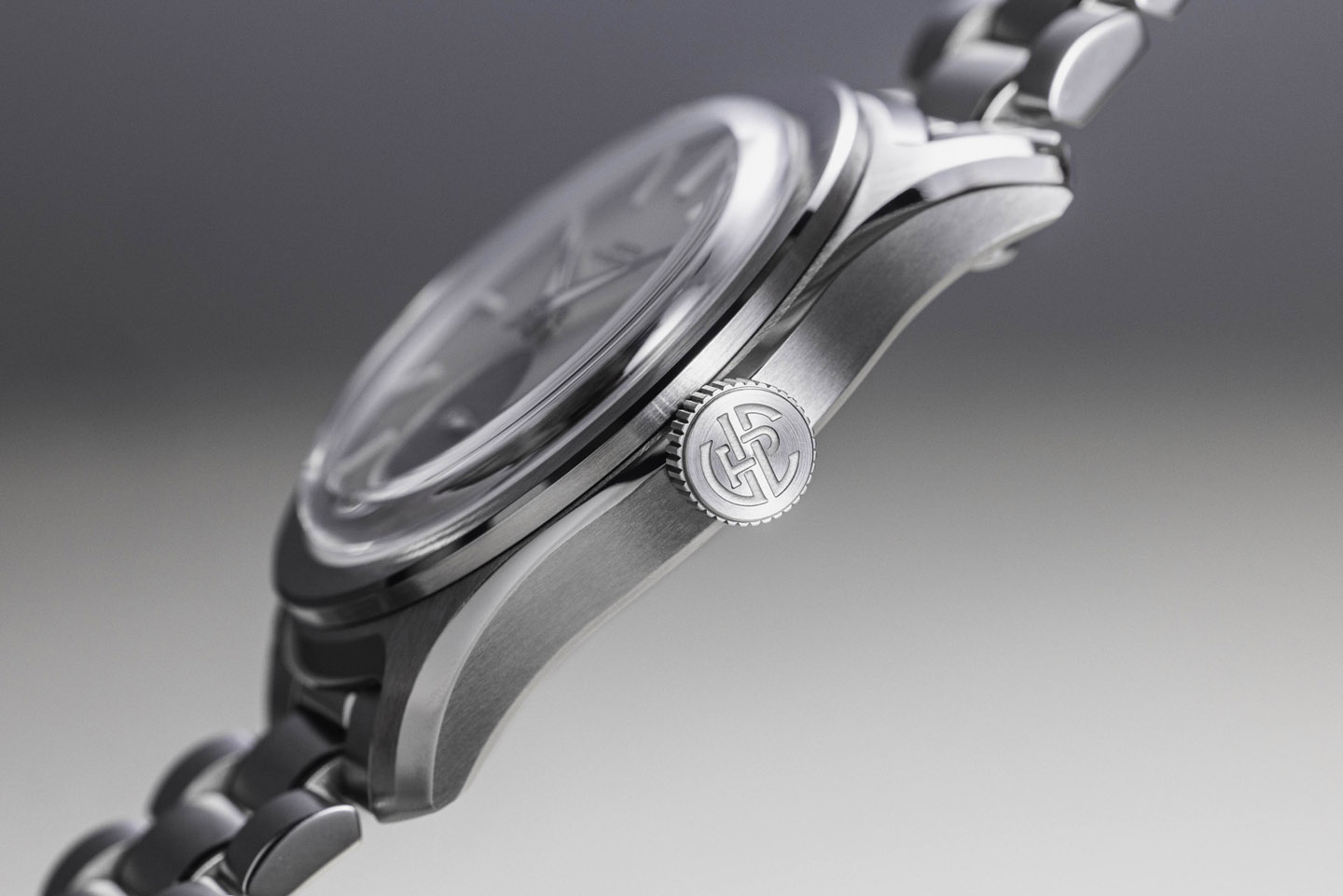
Determined to find a way to more elegantly integrate the case and bracelet than the widely accepted endlink, we came up with a unique new shape. A sculptured ledge between the lugs takes the old hooded lug concept and brings it into the 21st century. 

The solution allows the bracelet to tuck under the ledge, rather than up against the case. Combined with a multi-piece endlink, this creates the illusion of the bracelet running continuously, straight through the case. 

Strap lovers rejoice; thin straps can be tucked under the ledge in the same manner, allowing for a perfect gapless aesthetic. Thicker straps are accommodated with a second set of lug holes, a little further down the lugs. Our aim was to create the ultimate strap monster. No need to add that we have a 20mm lug spacing then, right?

> Learn more about our case and bracelet design here

Image: 3D-printed prototype case

TEXTURES

The VPC Type 37HW is all about textures. There are very few polished surfaces, merely functioning to accentuate the shapes and proportions. The case and bracelet feature deep, tactile brushing as you would expect from a high-end wristwatch. 

The dials are executed in a frosted texture, both for beauty and legibility. No gaudy sunbursts here. The details on the dial are as crisp as you will ever see them. The dials are milled, rather than stamped. Something you hardly ever see in the sub-€15k segment anymore but it is just so much more attractive. It is just another detail we care deeply about, that you may only notice at a second glance. 

LUME

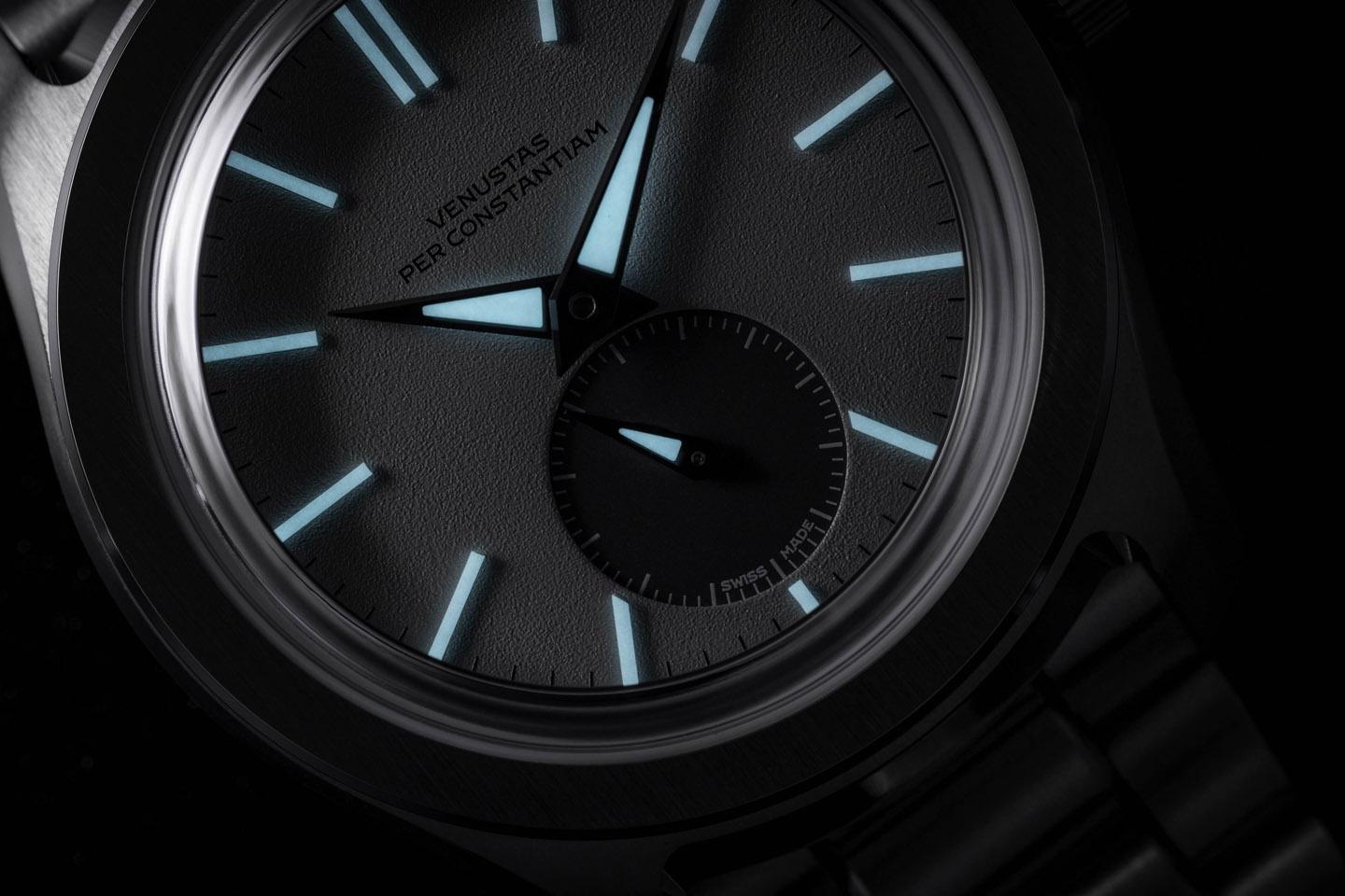
A great GADA watch has proper nighttime legibility. Since we also desired the elegance of narrow hour markers, we decided to opt for solid ceramic lumeblock indices. 

They are executed in green or blue luminescence and paired with either BGW9 or C3 Super-LumiNova in the handset, depending on the chosen dial color. A thick layer of lume in the hands assures a bright and lasting glow. 

We even went so far as to put a tiny lume bassin in the sub-seconds hand. Naturally, this will not be as bright, but it serves an important purpose nonetheless; it provides instant reassurance that you are looking at a wound and running watch, no matter how dark it is. 

> Learn more about our dials here


PURCHASING YOUR TYPE 37HW

300 Individually numbered pieces will be available during the first presale period.

Public launch of working prototypes: Late 2023

Presale round 1: Early 2024

Subscribe to our newsletter below to be first to know when the VPC Type 37HW presale starts.