Dials
The dial puts the soul into a watch. In fact, a great dial can compensate for poor case design. This is why we designed our case first, and only once we were completely satisfied started working on the dial.
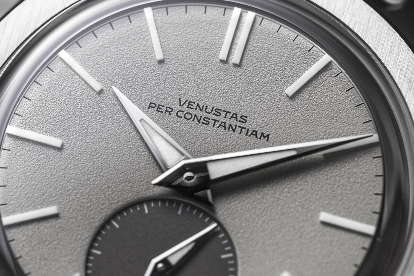
Following our core philosophy of “simple is hard but worth it”, we aimed to keep the dial as clean as possible. Note, for instance, how there is no text beyond the wordmark and “Swiss Made”. The required visual balance comes from the contrasting sub-dial instead. It anchors the dial, allowing for more negative space elsewhere.
The initial concept for the Type 37HW was a one-eyed panda dial. This is inspired by chronographs from the 1960s, which would feature two, three, or four contrasting sub-dials. As you can imagine, a white dial with two black sub-dials is reminiscent of a panda bear’s face. Since Type 37HW is a time-only watch, our translation features just one sub-dial at six. A one-eyed panda, so to speak.
But rather than literally referencing the past with black-on-white and white-on-black dials, we went for more contemporary colors. Our simplest silver dial features a darker seal gray sub-dial, for a subtle contrast. We have a dark sage green dial with an anthracite sub-dial and a “Delfts blauw” blue dial with a high-contrast silver sub-dial.
A high-quality dial is all about texture. We decided not to opt for the common sunburst or gloss finishes. We went for a matte frosted finish instead. This is inspired by the finishing of movement plates in old pocket watches, as Breguet applied for example. So while it is a nod to vintage watchmaking, it is in an indirect manner that doesn’t actually look like any vintage watch. We even omitted the standard radial striping or sunburst on the sub-dial to avoid design clichés. Rather, we maintained a similar frosted texture at a different resolution (finer), for an even and cohesive aesthetic.
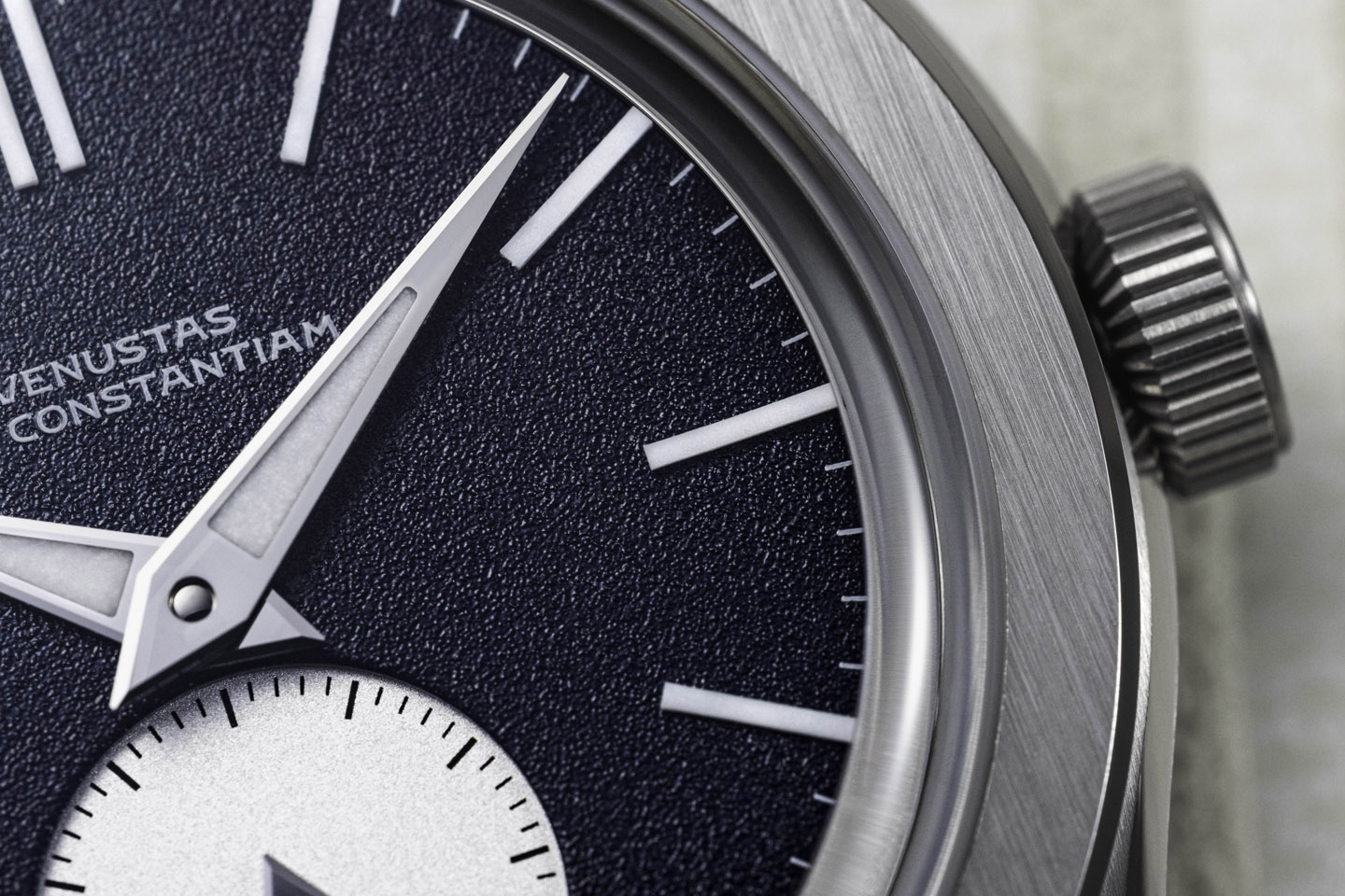
Another hint to the past can be found around the dial’s perimeter. It is stepped, like pie-pan dials from the 1950s and 1960s. But, again, we took the concept and translated it into a contemporary iteration. Our step is much narrower, only presenting itself under closer inspection. It features the same contrasting color as the sub-dial, to provide an anchor for that color. Without it, the sub-dial would look out of place. By keeping the step so narrow, we maximize dial space. This is necessary because our relatively broad bezel means the dial is relatively small. And so its diameter is emphasized through this narrow pie-pan step. A tiny (0.3mm wide) polished 45-degree chamfer around the top layer of the two-layer dial discreetly decorates the step.
Although very classical in shape, the hour markers are distinctly modern in material. We have opted for solid lumeblocks. This mixture of Super-LumiNova and a binding agent allows for very narrow indices, that are still highly luminescent. Had we opted for similarly narrow metal indices with applied lume, there would be so little lume that it would be hardly worthwhile. By maintaining a classical stick marker shape, the thoroughly modern material does not jump out at first sight. It takes a second look to spot that you are dealing with something a little more high-tech.
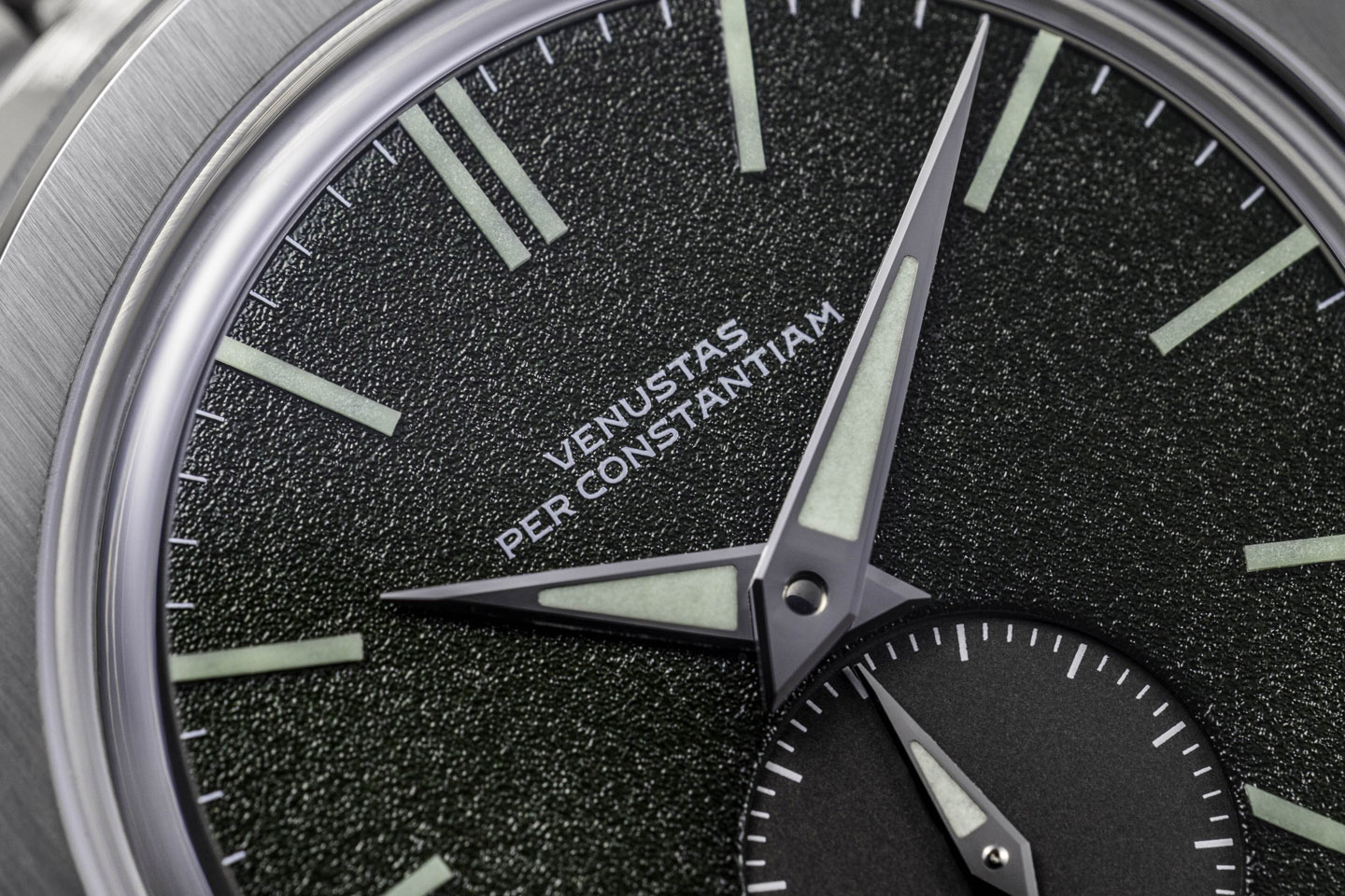
The hands are a similar mixture of the old and the new. They are classical dagger hands, providing both an aggressive aesthetic and very precise reading of the time. The lume basins, however, are trapezoidal, making the overall look a little more contemporary than if they had been narrow slits or diamonds. We have opted to lume the small seconds hand too. Although this will obviously be faint, due to the small amount of luminescent compound, it does provide you with the secure knowledge that your watch is running, when you read the time in the dark. The color of the lume is adjusted for each dial color, to complement it perfectly.
We have paid close attention to detail in our dial design. Note, for instance, how the minute and seconds tracks are never interrupted. A chronometer is all about precision. And so, you want to be able to precisely read the time. It makes no sense if the sub-dial or “Swiss Made” signature would have interrupted the minutes or seconds track, obscuring the precise time. And so, the “Swiss Made” signature is positioned just above the seconds track, for instance. Combined with the sharp handset with the perfect length, you can read the time with great precision. We feel that such decisions, even if not consciously registered, do make for a more cohesive and attractive overall design.
Our dials are made of two separate layers, not from a single stamped brass blank. This is quite similar to a sandwich dial, sans the exposed numerals. The resulting dials are just much sharper-looking, dimensional, and beautiful for it, compared to a stamped alternative. It is the labor and cost-intensive way, but it is the better way. In an effort to maintain minimum overall height of the watch, you will see there is no rehaut. We have a lowered hand stack that is pushed all the way into the domed sapphire. In fact, if you were to remove the crystal, you would see the minute hand make its rounds above the bezel(!). The hour hand is 0.5mm short of reaching the hour markers, or it would scrape them. There is minimal clearance everywhere to accomplish an overall height of just 9.8mm (7.6mm ex. crystal) while retaining the required material thickness for 120 meters of water resistance. As a major bonus, that leads to a more cohesive, compact aesthetic of the dial and hands compared to the over-spaced look of most watches.
Subscribe to newsletter
"*" indicates required fields