Typography
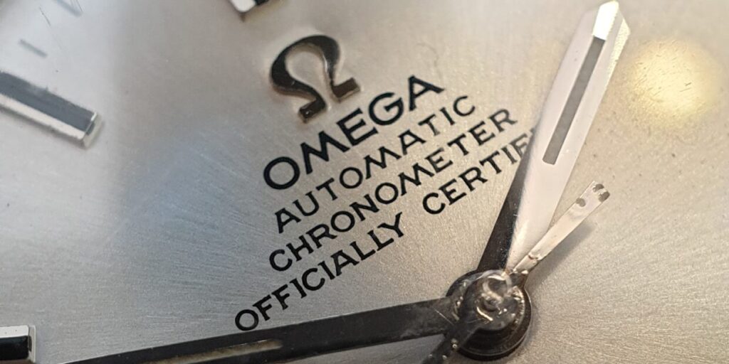
We have decided to pay homage to the history of watchmaking through our typography. The story of watch dial typography is absolutely fascinating. It was a craft that was largely responsible for the characteristic and highly attractive aesthetic of vintage watches. If you have ever studied a vintage watch closely, you have probably found quirky, oddly shaped lettering on the dial. Imperfect printing somehow made the watch feel more authentic and human than some of the flawless modern watches do. It is an art that has been lost to time.

HOW DIALS WERE PRINTED
To fully appreciate this, it pays to know a little bit about how these dials were made. Dial layouts would be hand-drawn by highly trained draftspeople. They used so-called technical pens to draw the dial on a larger-than-actual scale. These pens had a consistent line thickness or weight. So unlike a modern computer font, which is thicker at font size 14 than it is at font size 10, one could draw different sizes at the same line weight. This resulted in a beautifully cohesive look across the dial.
So yes, the entire dial layout was hand-drawn. That includes all text. This is why the text on vintage watch dials is so inconsistent and imperfect. Still, to focus on the imperfections is to cut the designers short. They were trained to do hand-lettering at a level you hardly come across anymore.
The resulting drawing would be photographed and projected (scaled down to the actual dial size) onto a photo-reactive etching compound on a metal plate. The resulting plate, with the dial layout now etched into it, is known as the cliché. This would be filled with ink, which a soft pad would then pick up. Pressing this flexible pad onto the blank dial would transfer the ink to the dial. This pad-printing—or tampography—allows for precise printing on uneven surfaces, such as domed, stepped, or textured dials.
Only a handful of dial makers supplied the entire watch industry. This is why you see so many commonalities between brands.

HOW THIS AFFECTED TYPOGRAPHY
So these dial designs had to be both legible at a very small scale as well as suited to the printing process described above. This resulted in some guidelines for the designers that are radically different from those used when designing for printing on paper or modern online use.
They had to space out their lines as much as possible. This can most clearly be seen in the 4. Its triangle is usually so small that it would quickly fill with ink. And so, the designers shortened its stem and added a flat top. These measures allowed for a much larger trapezoidal aperture, improving both printability and readability. The same trick is used on the often flat-topped A and flat-bottomed V.
If you look at vintage watch dials with these eyes, you will see many more elements shaped the same way. The M often has its outer strokes angled for more empty space. The S is unfolded a bit, sometimes all the way to straight ends.
Some characters were lengthened or condensed so that all were almost the same overall width (monospacing). This ensured that day and date wheels with different combinations of characters would always look consistent. The J of January, for instance, would get a very wide tail so that it would occupy as much space as the M of March.
Lastly, there was the risk of ink pull-up in the corners. And so the characters were embellished with small, pointy serifs. This would ensure the ink would remain in the sharp corners, keeping the overall form of the character intact.
Clearly, many choices were made on the basis of the printing tech of the day and small-scale legibility. Once those requirements were met, the rest of the typography was filled in in a matching style. A design language had emerged, which was consistently followed. So no, not everything you see on your vintage watch dial is functional. Much of it follows from a vernacular that resulted from earlier functional decisions.

VPC TYPOGRAPHY
As technology developed, these hand-drawn dials disappeared. The printing also became so precise and flawless that the design guidelines could be discarded. Today, many reputable brands use simple Arial text on their dials. This, in our eyes, is a big loss. The old typography had a quirkiness and a charm that added life to the watches. Something we wanted to bring back for VPC.
And so, we teamed up with typography designer Samuel Baker. He applied the VPC philosophy of being rooted in vintage without becoming overly vintage-inspired. Rather than copying the old fonts, he designed a new typeface from the ground up, playing by the old rules. He took on the role of a 1960 draftsman and designed a brand new typeface on the same principles.
The result adorns every single VPC dial. The Venustas Per Constantiam wordmark is rendered in this typeface, as is the “Swiss Made” signature. The specifications on the case back belong to the same typeface family. Even the VPC monogram is a creative adaptation of the same style.
Samuel is a bit of a purist. And so, for instance, the kerning of the typeface is customized for every single possible character combination. That means the spacing of the letters is always optically even, never breaking up or huddling together. Once you look at the average watch dial with these eyes, you will rarely see one that is actually truly well done. For VPC dials and case backs, even that custom kerning is corrected once more to ensure a perfect composition within the actual design. This is a very labor-intensive process but one well worth it.
This is the type of nod to history and attention to detail we aim to put in our watches. These things require significant investments of time and money, but they translate into something objectively better. Even if you don’t know anything about typography, the result just looks easier on the eye and more beautiful because it was done with so much love and attention. It does not really result in significantly more watches sold, so big brands don’t bother. But we feel this is the kind of uncompromising effort that gives VPC its right to exist. Something our well-informed clientele can appreciate and cherish.

Subscribe to newsletter
"*" indicates required fields
